

Up to 4.5% of your users may be color blind. If your users are mostly male, it could be as high as 8%.
Color blindness is the inability to perceive colors that others can perceive. People who are affected by color blindness do not see in black and white (at least the vast majority don’t), and they are not visually impaired – they can see just as clearly as anybody else. However, certain colors are indistinguishable to them.
To make matters more complicated, there are several different types of color blindness: weakness to red, blue, or green, blindness to red, blue or green, etc. There is another type of color blindness called monochromacy, which is the inability to see any colors at all, in which vision consists of shades of grey ranging from black to white. However, monochromacy is extremely rare, affecting only 1 in every 33,000 people.
It’s very easy for designers to forget about people who are color blind for one simple reason: most designers are not color blind themselves. Designers thrive on color. We take classes on color theory, and spend hours upon hours finding the correct balance of color to make their designs feel perfect. We learn about the emotional connotations associated with colors, and how those connotations may differ by culture. So how do we design for people who can’t see certain colors? Or even more challenging, how do we design for people who see colors differently than we see them?
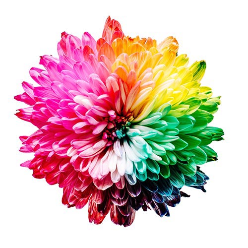
Normal Vision
Protanomaly (Red-Weak)
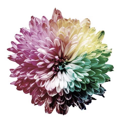
Tritanomaly (Blue-Weak)
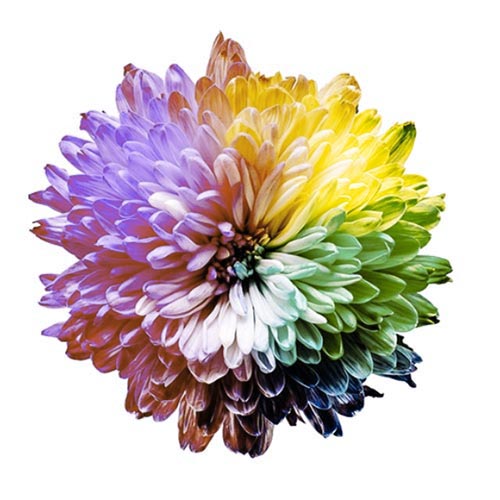
Deuteranopia (Green-Blind)

Tritanopia (Blue-Blind)

Blue Cone Monochromacy
1. Work in grayscale first, and add color when you have a great design without color.
Designing in black and white actually offers several advantages. It allows designers to think of their designs as color agnostic. By starting a design in black and white, we can focus on other design elements that bring strength to a design. It’s like those weird stories you hear about people losing a sense, and suddenly all of their other senses are heightened. It’s well documented that when you can’t see, your sense of hearing or sense of smell improves. This works the same way. I honestly believe that designing in black and white helps designers focus on things like visual weight, contrast, focal points, and balance. Take a look at the simplified example below. In this example, you can see that the black and white version is using visual contrast to identify the key focal areas, which work independently of color.


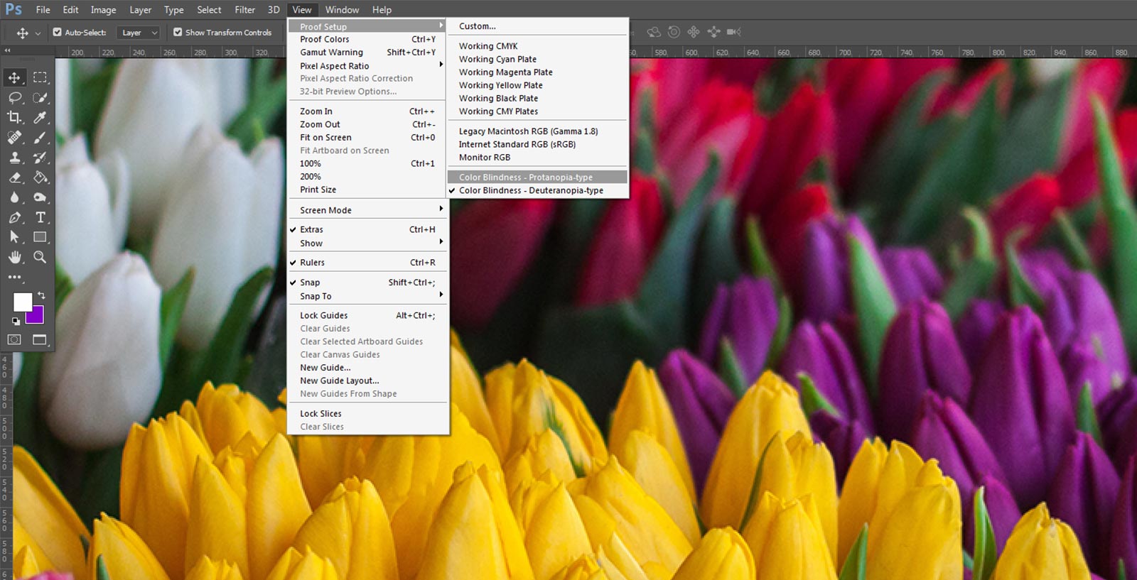
2. Use Photoshop's built-in color blindness proofing mode.
If you work in Photoshop, there’s actually a built in functionality to see how color blind people will see your work. Setting it up is really simple.
- Click on View > Proof Setup > Color Blindness – Protanopia Type, or Color Blindness – Deuteranopia Type.
Once you’ve selected the type of color blindness you want to simulate, it’s as simple as hitting Cmd-Y (on a Mac) or Ctrl-Y (on a PC) to switch between regular color mode and color blind color mode. As you’re designing, you can periodically stop to see how things will look for color blind people, and make adjustments as necessary.
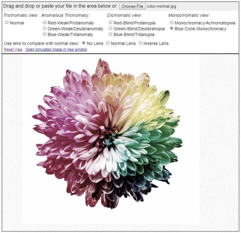
3. Use online simulators or legibility tests.
There’s countless resources out there that will really help you make designs usable for color blind people.
- WebAim.org has a Color Contrast Checker tool, where you input a background color and a text color, and it’ll tell you if normal text and large text will pass or fail to meet sufficient visual contrast. The typical goal to strive for is a contast ratio of 4.5:1 for normal text (body text) and 3:1 for large text (headlines, bold text, etc).
- Color-Blindness.com has a simulator that will let you upload images (or in-progress design projects) and compare up to 8 types of color blindness.
- CheckMyColours.com will let you enter any website URL, and it will analyze your CSS to give you pass/fail ratings on every color and text style on the page.
- I Want to See Like the Color Blind is a Chrome plugin that lets you select from various types of color blindness in order to see websites in a simulated color blind environment.
4. Avoid certain color combinations.
As a designer myself, I know the anxiety designers can feel when colors are off limits. It’s like having a tool removed from our toolbox. However, for the sake of making digital products accessible and easy to use for everyone, there’s a few colors that we should avoid using in combination with others, since they simply do not offer enough variation in contrast.
- Green and Red
- Green and Brown
- Blue and Purple
- Green and Blue
- Light Green and Yellow
- Blue and Grey
- Green and Grey
- Green and Black
That’s not to say these colors can never be used together. But if you’re using these colors with an implied purpose, like denoting interactivity for example, you may want to consider using a secondary method to draw attention to key colors. For example, you could put a link in a button, or underline in, instead of just using plain text in a different color.
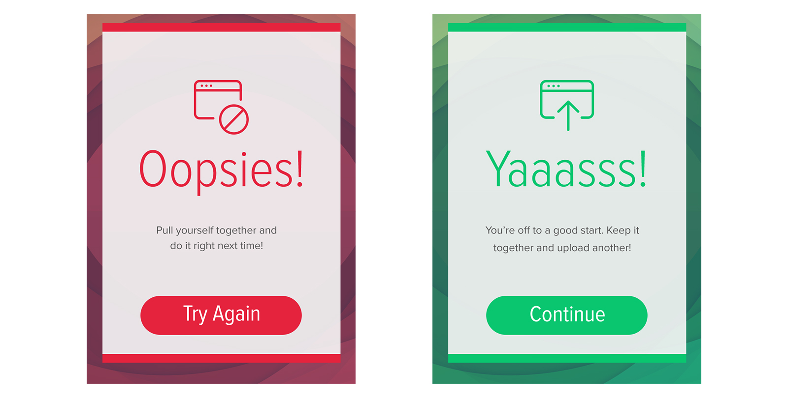
Another trick you could employ is to accompany things like alerts with icons. For example, a contact form might use red or green highlighted feedback to denote success or failure of delivering the message. Since these colors would appear identical to people with certain types of color blindness, the feedback could easily be accompanied with a clear message or distinct iconography to get the point across.
Additional reading
Here’s a great page from Maryville University with tons of information on color blindness, its diagnosis, and how to manage it. Special thanks to Ben, a young visitor of this site, for his research and passion in this area!