
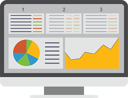
If a picture is worth a thousand words, then good data visualization dashboard design must be worth a million. Analytical dashboards tell a more complete story than simply displaying raw data, and are limitless in the breadth of data they can communicate in a single visual. That said, it’s important to use data visualizations effectively to support business objectives and data-driven decision making. Data visualizations should always simplify and clarify information, and be presented within the context of the user’s workflow, while avoiding confusing the viewer or leading to mistaken data interpretation.
This guide covers data visualization dashboard design from start to finish, and describes a methodical and systematic approach. You won’t find tips here for making dashboards pretty with nice visuals. This is about optimizing dashboards for adoption through user-centric design, visual storytelling, and effectively summarizing massive sets of complex data.
User-Centric Design
There is a huge difference between design and user-centric design. Understanding that difference is the most important principle in meaningful data visualization dashboard design.
User-centric design seeks to help users solve problems. It is always the answer to a question. But you need to understand that question first in order to solve it through design. User-centric design in the context of data visualization dashboard design is a methodical approach that seeks to adapt to the way users work, rather than expect the user to adapt to the tools they have access to.
Through requirements-gathering and an understanding of the tasks, needs, and decision-making criteria of a user, data visualizations should be presented in a format that transforms it into information that is easily consumable and immediately actionable. With this in mind, it’s important to remember to design data visualization dashboards around the user’s process, not around the data itself.
User-centric design is…
- Predictable and consistent in behavior and style
This minimizes the learning requirements for users. Think of individual parts of a dashboard as a modular and scalable system, not as separate “pages”. It should always be intuitive, and follow consistent patterns. - Simple and natural dialog, stripped down to the minimum essentials
This reduces unnecessary effort. Messages and instructions should use the vocabulary of the intended audience. Terminology, colors, etc., should be clearly defined and always have the same meaning. Remember, the star is the data, not the interface. When it comes to data visualization dashboard design, the perfect interface is an invisible interface. - Accessible and easy to use
Be sure to think through navigation systems and how users navigate through data in order to understand the full story. Both vertical (drilling down into data with a single path of analysis) and lateral (switching between multiple paths of analysis) navigation patterns should easily move both forwards and backwards.
Ask yourself…
- What is the user’s role?
For example, what decisions does the user make from the data? And what questions do they need answered? This determines how information should be structured to prioritize the most critical answers. - What is the user’s workflow?
For example, what is the context in which the dashboard and data will be viewed? And what are the user’s next steps after viewing it? This determines how the dashboard will fit into a user’s process, and the types of actionable insights the data should communicate.
Designing Focused and Meaningful Dashboards
Content precedes design. Design in the absence of content is not design, it’s decoration.
The above quote from Jeffrey Zeldman is as relevant for data visualization dashboard design as it is for any type of design. The goal isn’t to make the data look good or use an awesome new visualization technique that nobody has seen before. The goal is visual storytelling. We want the data to communicate a message that is powerful and more immediately recognizable than simply browsing through tables of numbers.
Design plays a crucial role in visual storytelling. How a dashboard is structured helps users understand the story, and shapes their understanding of not only the big picture, but how all the smaller pieces fit together to form that picture. Finding the right structure for a dashboard gives that story a beginning and an ending, and helps the user understand what comes next.
Data visualization dashboard design that tells a story:
A gradual reveal or waterfall dashboard
In this dashboard type, the user follows a logical progression of analysis, exploring a data from the top down. The user selects a metric and then explores that metric across various levels of the organization, using contextual clues to guide the analysis. As subsequent selections are made, the data set is filtered and narrowed.
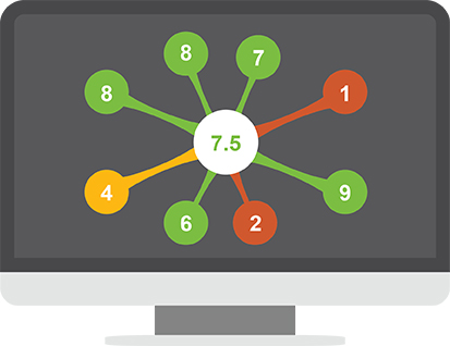
A relationship dashboard
In this dashboard type, individual elements are arranged in a way that shows relationship and causality. It emphasizes the connection between entities. These connections may be geographical, organizational, functional, or any other kind of relationship.
A scorecard dashboard
This dashboard type provides the easiest “at a glance” indication of where problems are located, making it easy to identify the most critical path of analysis. A scorecard provides an overview snapshot, keeping the interface simple and uncluttered.
How to tell if your data visualization dashboard design tells a story
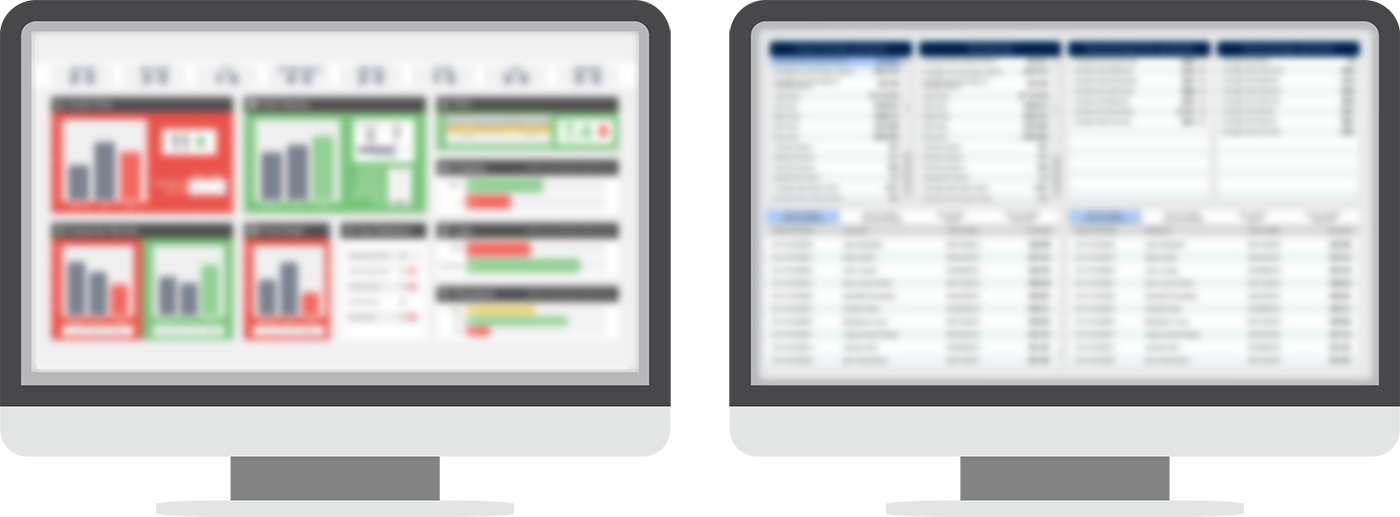
I am very proud of the process I’ve developed to test if my data visualization dashboard design communicates a message and tells a story. It’s a highly complex, very technical and very scientific method. I call it the squint test. The theory is this:
If you squint your eyes to where you can’t read a single word or number on the dashboard, you should still be able to draw some conclusion about the data being displayed. – Gareth Botha, Scientist
Take a look at the image below, where I’ve used highly technical Photoshop techniques (blur filter) to simulate the highly scientific squint test. What if I told you that these two dashboards are both showing the same data? On the left, a very clear story is being told. You can immediately discern good performance from bad performance. You can immediately pick out an individual path of analysis to determine what went wrong or what went right. It is immediately actionable. On the right, there is no visual storytelling. The dashboard is not communicating a message, it’s simply displaying data.
Picking the Right Visualization for the Job
Data visualizations turn complex data into something that can be understood at a glance. They should always simplify and clarify data.
One of the trickest, but most important aspects of data visualization dashboard design is using the right visualization for the story the data is intended to tell. When you use the wrong type, you could be going against this principle, and you risk confusing the user, or worse, leading to the wrong interpretation of the data.
There are five primary types of data visualizations:
I’ve outlined the five primary visualization analysis types below, and provided some examples of each that are commonly used and easily understood.

Comparison
Use these when you want to compare values in one or more data sets.
- Bar Graph – Gold standard for comparison between values within a single data set, as each bar shares a common axis.
- Stacked Bar Graph – Useful for comparing values of categories across multiple data sets.
Composition
These show how individual parts of a data set make up a whole.
- Pie/Donut Graph – Represents data in percentages, as the sum of each segment adds up to 100%.
- Stacked Bar Graph – Used for comparing composition across multiple data sets as percentages (ie: the upper limit of the variable axis is always at 100%).
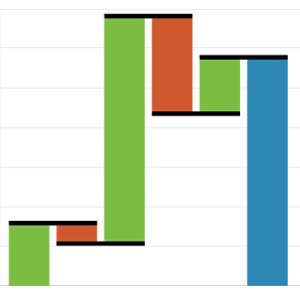
- Waterfall Graph – Used when values within a composition could be positive or negative.
Distribution
These show how data is distributed across a data set, and help identify outliers.
- Scatter Plot – Useful to show correlation between variables. Can be positive (both variables increase together) or negative (one value increases as the other decreases).
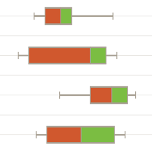
- Box and Whisker Graph – Useful for displaying variability outside of upper and lower ranges.
Trend
These show performance over time, and help identify time-based outliers like abnormal highs or lows.
- Line / Column Graph – Simplest ways to show change over time.
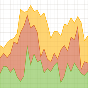
- Stacked Area Graph – Multiple line graphs that have been filled with color and overlapped to highlight variance between data sets.
- Dual Axis Line/Column Graph – Comparing completely different types of data sets over time to understand causality.
Relationships
These show the relationships between data sets, to help form an understanding of how they are interconnected.
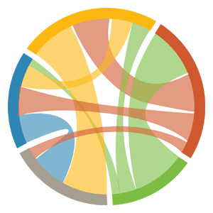
- Chord Graph – Shows inter-relationships between groupings, ideal for comparing similarities in a data set.
- Bubble Graphs – Similar to a scatter plot, but uses additional variables, represented in colors and sizes.
- Mosaic – Stacked bar graph where the x-axis now has a numerical value, making it possible to detect relationships between categories and sub-categories.
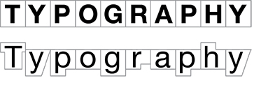
Typography
One of the biggest mistakes you see in data visualization is not optimizing typography for readability and comfort.
Convincing stakeholders of the importance of typography is usually a tough sell. It’s just text, right? Who cares if it’s optimized or not? Well imagine a table of data that is 50 lines long and 8 columns wide. Now imagine that table of data is looked at 10 times a day. Now imagine that table of data is looked at 10 times a day by 200 business analysts. Now imagine that table of data is looked at 10 times a day by 200 business analysts who draw important conclusions, and then make critical decisions from that data.
See where I’m going with this? Take a look at the two images below. Which text style would you rather use in the scenario I just described?
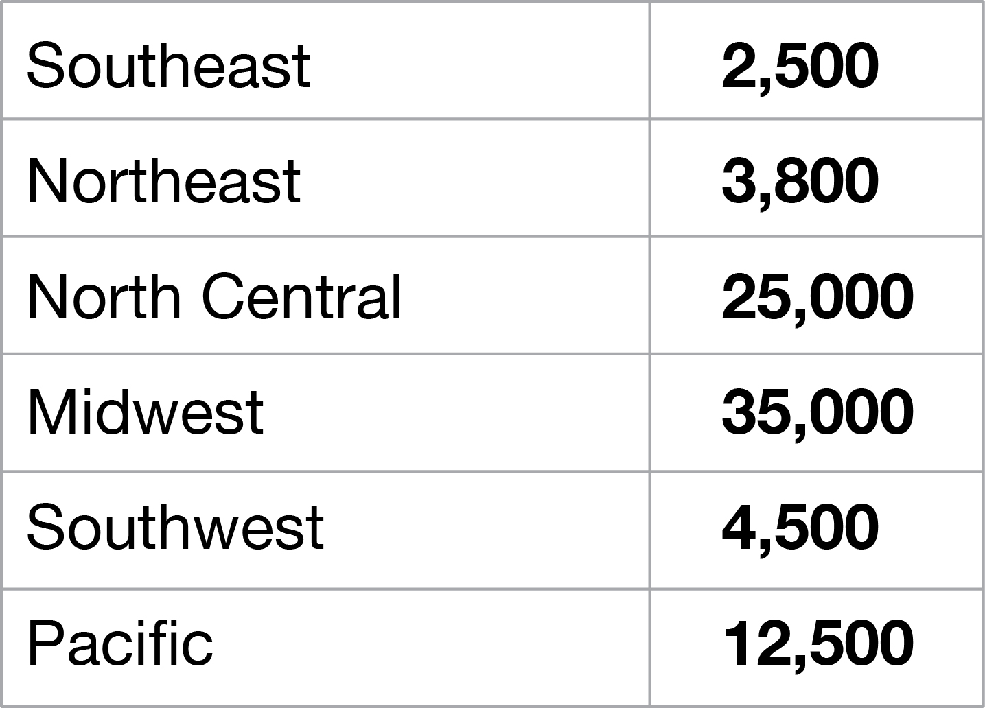
The table on the left would be unbearable to try to read in that scenario. All the text is bold, which means nothing stands out. All the text is all caps, meaning the words have no unique shape. When words don’t have unique shapes, then each word has to be read individually, because we can’t speed read them at a glance. The table on the right is optimized for readability. It uses contrast (bold text versus normal text) to highlight important details. It uses title case text to preserve word shapes, making scanning down the column simple.
To understand more about why word shape is so important, read the paragraph below.
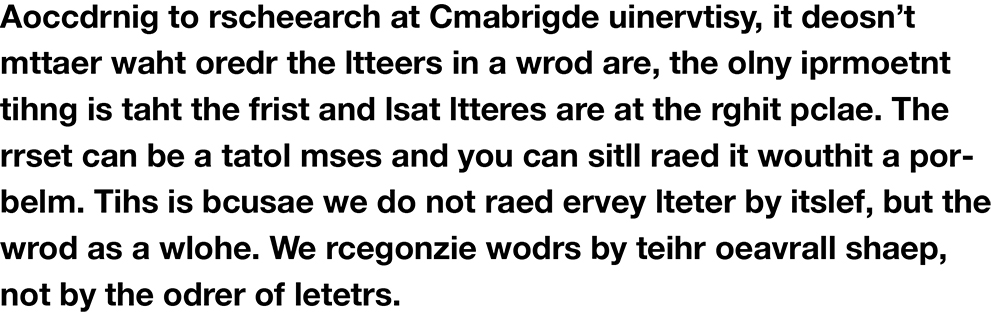
The reason you’re able to understand the above body of text, despite the fact that almost every word in it is a jumbled mess of misspellings, is because the word shapes are preserved. We recognize the shape of the words and the proximity of letters to one another.
Color
Color is subjective, and based on anything from personal preference to cultural background. But not in data visualization dashboards.
Color is tricky, because it’s so subjective. Anybody designer who has needed to have their work approved by more than one person knows this. Madison in accounting loves blue because it was her wedding color, but Mike in sales hates blue because it’s the color of his favorite college football team’s rivals. While this is often still true in data visualization dashboard design, especially at an enterprise level where you’re often having to consider variables like branding, etc., there’s a few universal truths when it comes to color.
- Color should always be representational and consistent
It’s not enough to establish that green means apples and purple means grapes. What’s important is ensuring that every time green is used, it means apples, and every time purple is used, it means grapes. Colors should always have a meaning, whether it’s based on performance, categories, etc. - Colors should always be meaningful
If we establish that green means good and red means bad, then whats average? What’s the high-end of acceptable? What’s the low-end of not great but not quite bad? What’s really close to bad but still acceptable?
Using combinations of colors purposefully and meaningfully
While there’s no one-solution-fits-all selection of colors that will work for all purposes, there are three combinations of colors that can be used to meaningfully assist in telling a story through data.

Sequential colors
Various shades of a single color are used to indicate value. The intensity of the color indicates a value range.
Useful for stacked bar graphs showing different ranges within a single data set.

Diverging colors
A gradient of colors indicate performance. This could be as simple as two colors, or as many as dozens.
Useful for performance benchmarks, highlighting KPI’s, and visualizations like heatmaps.

Categorical colors
Colors are used to denote a category or a distinct group, rather than a variable. It’s critical to use high contrast between adjacent colors.
Useful for comparison and composition visualizations, like pie charts, bar graphs, etc.