

A UX research database is a centralized repository of data collected in user studies. It acts as a shared knowledge base of user sentiments and the insights they bring.
The goal of creating a UX research database is to have a shared understanding of pain points that a product’s users experience. And more importantly, a methodology for prioritizing and resolving those pain points.
Collecting qualitative data through user studies and usability interviews, and then trying to address the details that arise, simply is not enough. These activities bring in a wealth of data points, but unless that data can be analyzed and converted into valuable insights, they likely fall short of the value they have the potential to bring. On their own, each piece of feedback from users only tells individual perspectives, or single parts of a story. Without the context of weaving those perspectives together, it’s like trying to re-write a whole book after reading just the first sentence. It just doesn’t work!
A good analogy to understand this concept is to think of the pixels in a photograph
You can zoom down to the level of individual pixels, but it would be a fools errand to try to make edits to the photograph at that level. You can’t look at the pixels in the above image and think “these ugly brown pixels are supposed to be a beautiful pink berry“. And doing massive color correction editing to the photo at that level would be impossible, because the understanding you get from a single pixel is completely meaningless. It’s not until you zoom out and start to see the bigger picture that you realize what those pixels represent, and how they’re connected to the image as a whole.
A qualitative data point, in this analogy, is the individual pixel. Its’ existence is absolutely critical to see the big picture, which wouldn’t be the same without it. On the other hand, it’s also entirely dependent on all the other data points for that picture to make sense. On its own, a single data point simply does not tell a meaningful story.
How to set up a UX research database of your own
It’s perfectly fine to use a spreadsheet like Excel or Google Sheets to track user insights. But if you want the power of a database, you need something a little more robust. To me, the ability to cross-reference parts of the data, and pivot it into different views and groupings is essential. My tool of choice here, hands down, is Airtable. I did a lot of research before picking a tool that would allow my UX research database to grow and scale effectively, allow me full customization, and still have the power to organize data points the way I need it to. I also wanted to be able to cross-reference similar data points (such as viewing all users who provided similar feedback, or seeing all feedback pertaining to a certain product area, etc). Airtable was the clear choice across the board for its simplicity in these actions.
Out of the box, Airtable actually already has a template for a User Research Database, which is a great starting point. I didn’t find it to suit my needs exactly so I created one from scratch that is more optimized to my process and workflow. Below, I’ll outline how I have my database configured, and why.
The workhorse of my UX research database is the Feedback Notes table, containing all the interwoven insights and solutions that comes out of user studies
Every row in this table is a record that represents an insight that came out of user feedback. These could have been in a comment to a team member, a UX study, or a user interview. I spend a lot of time grooming the contents of this table, to keep the data clean, accurate and current.
The columns in each record are:
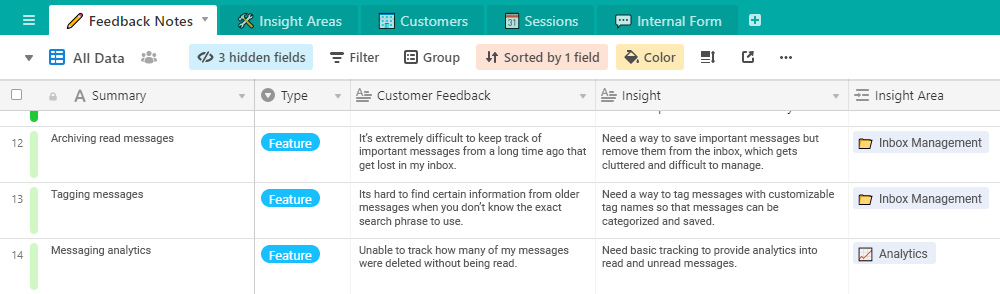
Summary
This is the catchy name for the solution to the problem. I write a short blurb for the feature or enhancement that addresses the insight. Typically, I keep these short, with no more than five or six words. I use them as “tags” in other parts of the database, which forms long lists in some cases.
Type
This is a dropdown selector, with a choice between feature or complaint. Sometimes the solution to the feedback is a new feature. Other times it’s an adjustment to an existing feature.
Customer feedback
A summarized version of the feedback provided by the user. This in some cases is an exact quote or transcript of customer feedback. But I usually paraphrase to include context around the conversation or for brevity.
Insight
This is the key to the whole effort. The insight represents the root cause to the user’s problems. By understanding the root cause, you can focus on truly solving the pain points, rather than putting a band aid on them.
Insight area
Entries in this column are actually links to individual records in another table. These act as a pivot view of all insights within a specific grouping of insights, for a holistic view of how users see those areas.
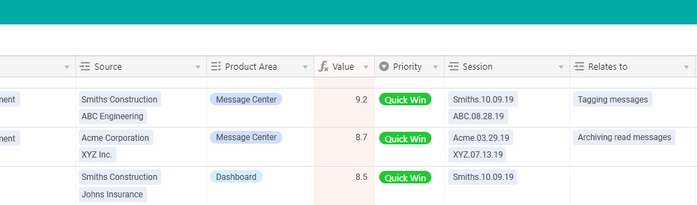
Source
A list of all customers who have given feedback that has directly led to this insight. Each one is a link to a record in the Customers table, which gives a pivot view of all the feedback that each customer has provided.
Product area
A single area of the product that the insight relates to.
Value
The number in this cell is actually a formula that is an average of three equally weighted values that I have in three hidden fields. Each is on a 1-10 scale, so the overall value is a 1-10 score. The three values represent: 1) the ability of the solution to solve the pain points described, 2) the expectations customers have for a solution, and 3) the types of personas affected.
Priority
I rank priorities into what is essentially a crude priority matrix (picture a graph with effort on the x-axis, and value on the y-axis). Anything with a high value and a low effort is a no brainer, and I prioritize it as a quick win. High value and high effort is a long term goal. Low value and low effort is a filler, usually a quality of life improvement that gets slotted in here or there. Low value and high effort is most likely a waste of resources.
Session
These are links to individual records in the UX studies or user interviews, showing a pivot view of all sessions, and the feedback associated with each.
Relates to
These are links to other records within the same table. This allows me to see how an insight is directly related to similar or complimentary insights, as they may need to be addressed simultaneously, or one may be a pre-requisite for the other.
Further configurations of the Feedback Notes table
A few key configurations make this table more actionable, and make valuable details immediately visible at a glance.
I use the “Color” function to provide a basic threshold of the Value column. You can see these as the colored stripes on the left of the first column. As a reminder, the Value column represents a score based on the average of three criteria. This threshold has five value ranges: 0 to 2 (red), 2 to 4 (orange), 4.1 to 6 (yellow), 6.1 to 8 (light green), and 8.1 to 10 (bright green). Green means go!
I configure the table to stack rank all records in order of priority. The most valuable records are always at the top of the list.
I also switch back and forth between saved views that utilize the “Group” function on the Priority column. This allows me to separate these insights into the four buckets according to the priority matrix I mentioned earlier. Additionally, I have a fifth Priority group, which I call Top 3, containing the three biggest problems I am currently trying to solve. I may not always be working on solving these problems, but I want them right there in front of me at all times.
Everything else
I use the other four tables in a far more tactical way, mostly for reference purposes. I won’t go into as much detail on those, but here’s a high level overview.
Remember, sometimes the most valuable user feedback comes when you didn’t ask for it.
Insight Areas table
This is a grouping of insights that may not be directly related but are part of the same experience. I use this as a means of viewing insights that also pertain to a solution I’m analyzing. That way I can see if there are opportunities to kill two birds with one stone. A solution that solves multiple problems at once is always an easy sell. This table consists of two columns only. The primary column is a master list of all Insight Areas, and the second contains links back to the main Feedback Notes table for however many insights there are in each Insight Area.
Customers table
A list of all customers and users that have provided feedback, acting as a summarized view of all the comments provided by each. The primary column for each record is the customer (business) name. The 2nd column links back to each feedback record in the Feedback Notes table. Another column links to a Sessions table where all UX studies are recorded. I also have columns for the customer’s physical location. If I’m traveling out of town to conduct user interviews in a location, this helps identify opportunities. And lastly, a CSM column lists an internal point of contact who can make introductions or assist with setting up meetings.
Sessions table
This table acts as meeting notes from all UX workshops and interviews. I can easily see all sessions that have been conducted with individual customer teams. One column lists all the meeting attendees and their roles. Another lists the meeting date (which has a calendar view, as an added bonus). Of course, I include an Insights column that links back to the Feedback Notes table, and all the insights that came out of the meeting. I also include a column that links to any supporting file or document (meeting agenda, video, recording, etc).
Internal Form table
The Internal Form table brings the truly collaborative nature of this database to light. Remember, sometimes the most valuable user feedback comes when you didn’t ask for it. This table is essentially a raw data entry point, with a corresponding easy to use form. This is how, organizationally, anyone on the team can contribute to a UX research database. Since everything in this form is logged as raw feedback data, I analyze it to understand the pain points, and process it into the Feedback Notes table, along with the corresponding insights it delivers.
After a lot of time researching various tools, and even more trial and error with experimenting to find the optimal setup and configuration, I’ve found that this is what works best for me. It’s optimized for a process of harvesting user feedback, converting into actionable insights, and grooming for meaningful solutions. I hope this summary is helpful in your own exploration into the exciting world of documenting feedback and insights!
At the end of the day, there really is no right or wrong way to have a UX research database, as long as you’re listening to users, recognizing the value of their viewpoints, and empathizing with the pain points they face along their customer journey.